

One of the biggest question design leaders face is, How do we get buy-in to overhaul our company’s branding? As anyone that’s been involved in a brand redesign knows, it’s not a small task. In a startup, getting buy-in can be extra hard because projects like this can seem like a “nice to have.” As such, they’re often deprioritized.
However, at a certain point, startups outgrow their initial brand identity. Initial branding, while once good enough, can impede your ability to connect with customers or recruit top talent. Meanwhile, the longer the old branding is used, the more content your team will need to update once the rebrand is complete.
If there’s one thing that startups don’t love, it’s throw-away work. We are frugal by nature, so any opportunity to save time and money in the future is a worthwhile cause—IF there’s a clear path to launch and IF the effort doesn’t get in the way of other priorities.
7 steps to rebranding your startup’s visual identity
So how do you create a clear path to launch and justify the effort as a priority? There are seven core steps your design team should take to establish buy-in and keep the wins coming throughout your redesign process.
1) What isn’t working with your current branding?
It’s important to understand how your company and colleagues use the current branding. While designers may design the ‘happy path’ of branding material, the reality is someone will eventually come along and modify something to fit their needs. It’s important to keep track of these modifications to understand how your branding and templates need to scale in the future.
Here are some questions to get you started:
- How are people currently using your branding today?
- Where is the branding running into issues?
- What is missing from the current branding?
At Vendia, we had a few challenges, and they’re not atypical in startups (let alone in heritage brands).
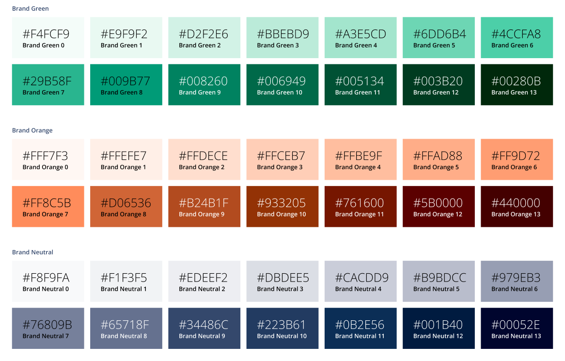
Inaccessible color scheme
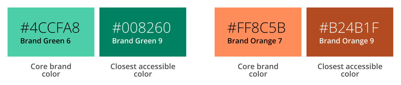
While our colors were bright and warm they presented a few accessibility issues. The largest issue was that our core brand colors were not accessible as text on a white background.
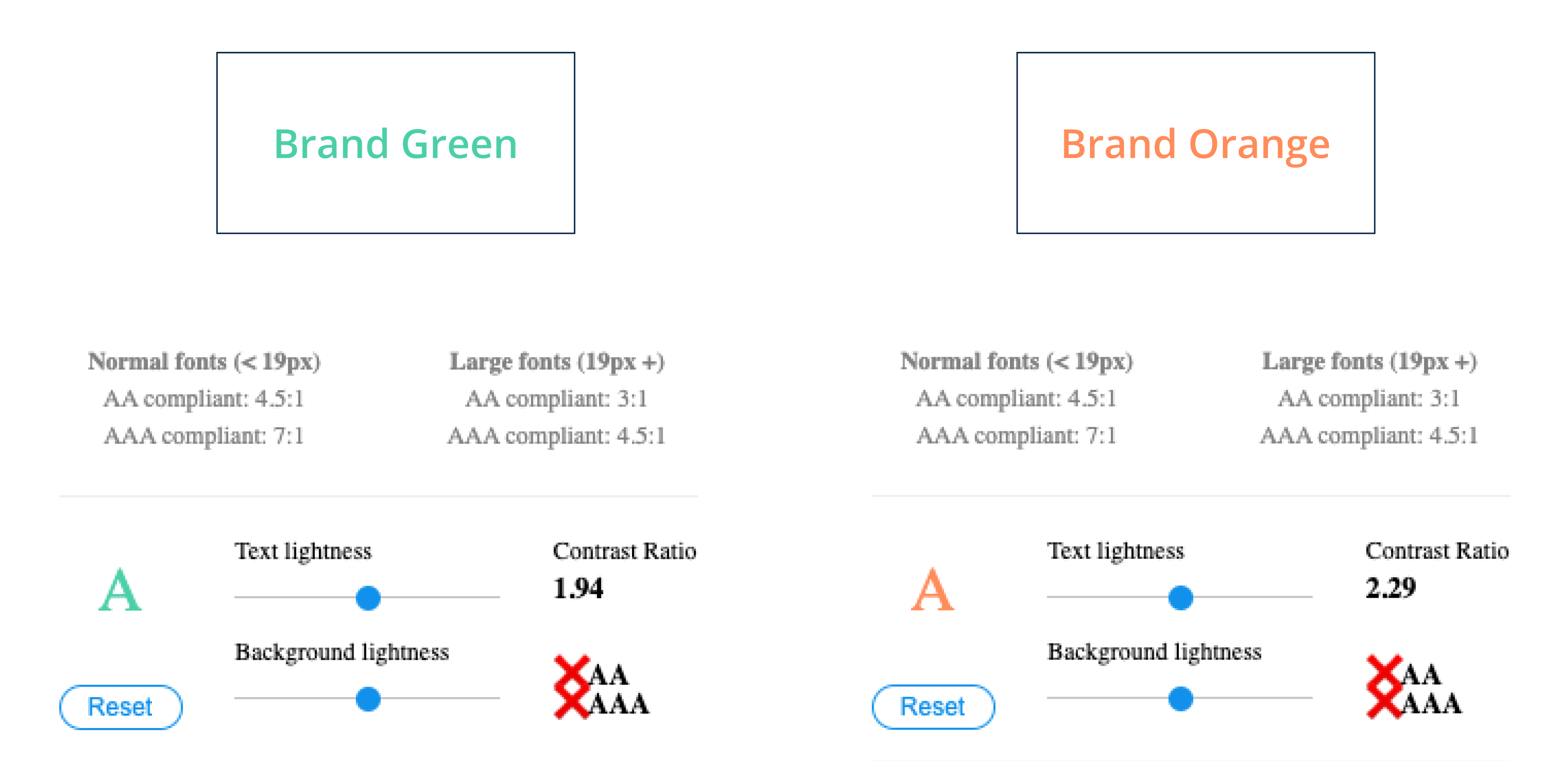
This presented an issue when people wanted to use the brand colors in presentations, advertisements, and print media. It was especially problematic when we used them on the web or in the product as it made buttons and links hard to read.
While we did have color ramps that provided additional colors, the closest accessible colors were very far from the bright, warm vibe the original colors held.
We also had an issue with color contrast. Because our core colors held a similar saturation, they tended to mute each other rather than complementing each other or “making our branding pop.”

Conflicting visual messaging
Conflicting visual messaging is a problem that’s somewhat unique to tech. Error and notification messages are widely used in web interfaces. There are four primary colors used to convey the difference in these messages: Blue = Information, Green = Success, Orange = Warning, Red = Error. In our case, our brand colors were nearly interchangeable with success and warning. Talk about sending a mixed message!
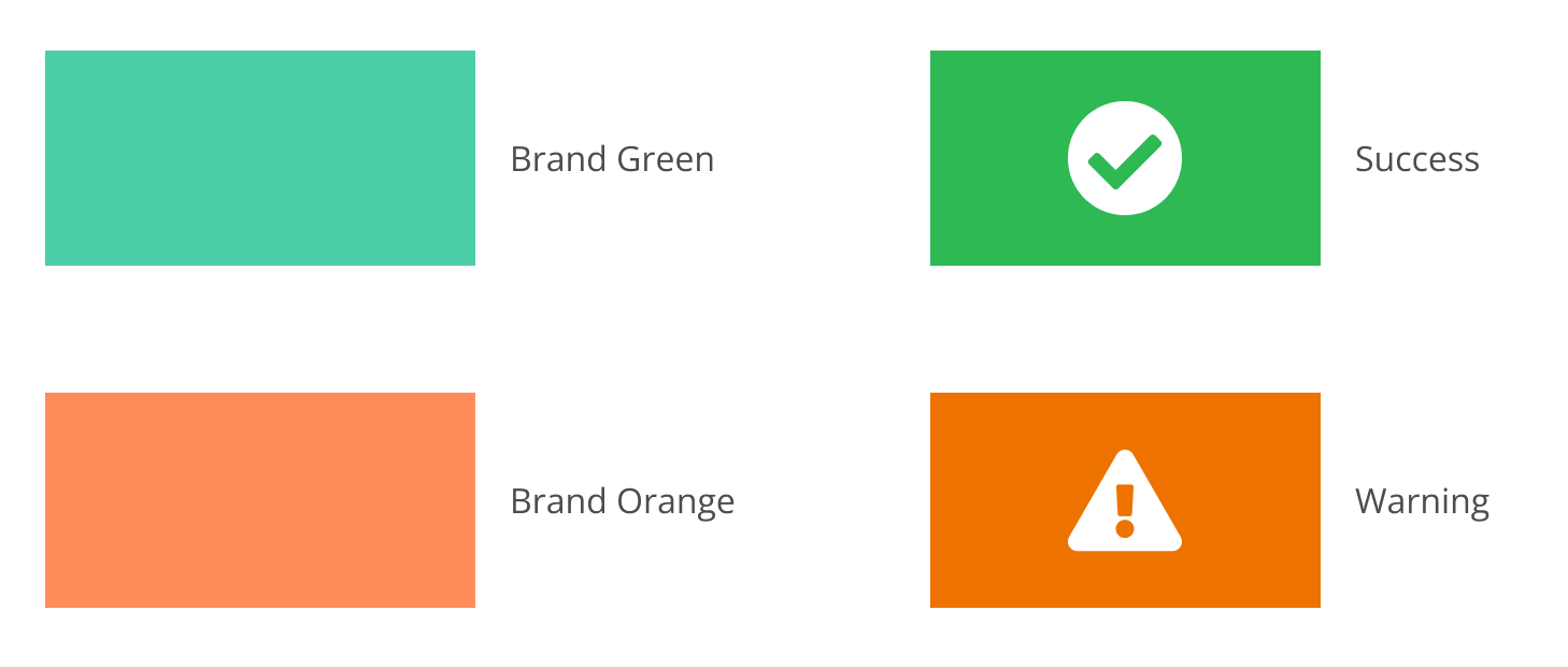
Not only did this conflict make it hard to leverage the branding colors in the UI, but it was also hard to express well in product diagrams. We rarely used our brand Orange because it could be interpreted as meaning something bad.
Limited color palette
While we did add a neutral blue ramp to improve accessibility, the overall color palette was limited to three main ramps. This made it difficult for people to leverage the brand colors in marketing and presentations.
Inauthenticity
Investors and customers described our branding as “cold” or “early 2000’s tech.” Neither of those descriptors reflect Vendia as a company or as a culture. Which ultimately raised the questions, “Who are we as a company?” and “How do we want to be known?”
2) What does your branding need to convey?
Your branding should ultimately reflect who your company is and what it does. Some questions to get you started are:
- What adjectives would you use to describe your company?
- What needs do you have in regards to your branding?
- What objectives do you want to meet with your branding?
For Vendia, we wanted a style that achieves the following:
- Communicates our kind, friendly and fun nature
- Scales with us as we add additional features and products to our portfolio
- Is unique and stands out against the crowd of tech companies
3) Do your research
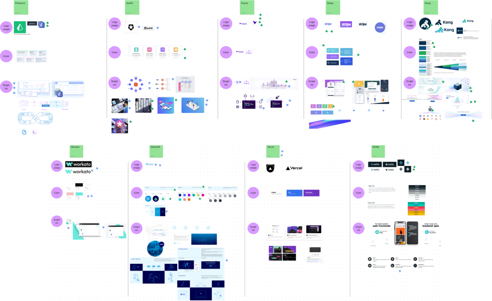
Always. Do. Research. This can be as extensive as interviewing customers, partners, and investors to understand how they feel about your brand, product, and company. It can also be as small as researching what companies in the industry are doing and identifying what might (and might not) work for you. No matter what you do, there should be some level of research to help you identify the path forward.
At Vendia, we did both: We gathered initial reactions from investors and customers, and we followed that with a competitive analysis of companies in the industry. We then created a FigJam board with examples of logos, colors, iconography, and graphics to help us compare and contrast concepts.
4) Identify a few concept options to explore
Having multiple concept options allows you room to explore without getting attached to an outcome. Don’t get me wrong, you will get attached (and your favorite will likely change throughout the process). But your objective is to flesh out each option enough that you like parts of each.
Some questions to get you started are:
- What options do you want to move forward with?
- What do you like about them? Why?
- What is unique about each?
- What do they have in common?
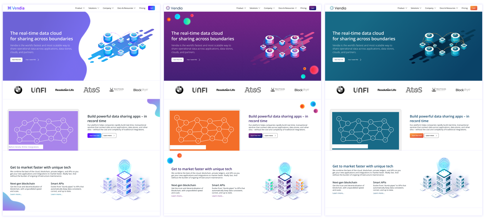
For Vendia, we established three options. On the design team, we dubbed these options: “Fluffy Cloud,” “Neon,” and “Monochromatic.” Then, we created a mood board with examples of each.
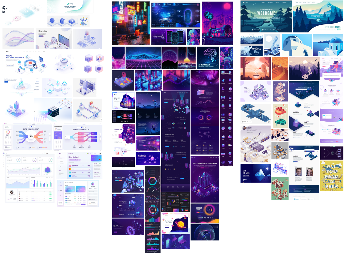
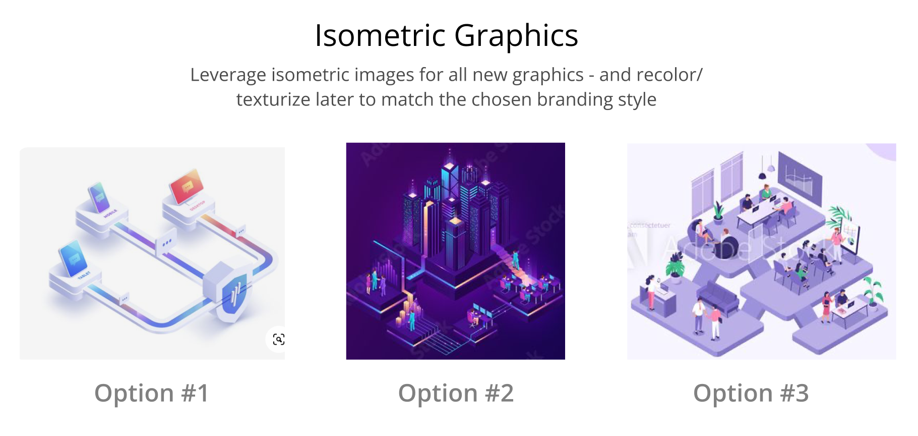
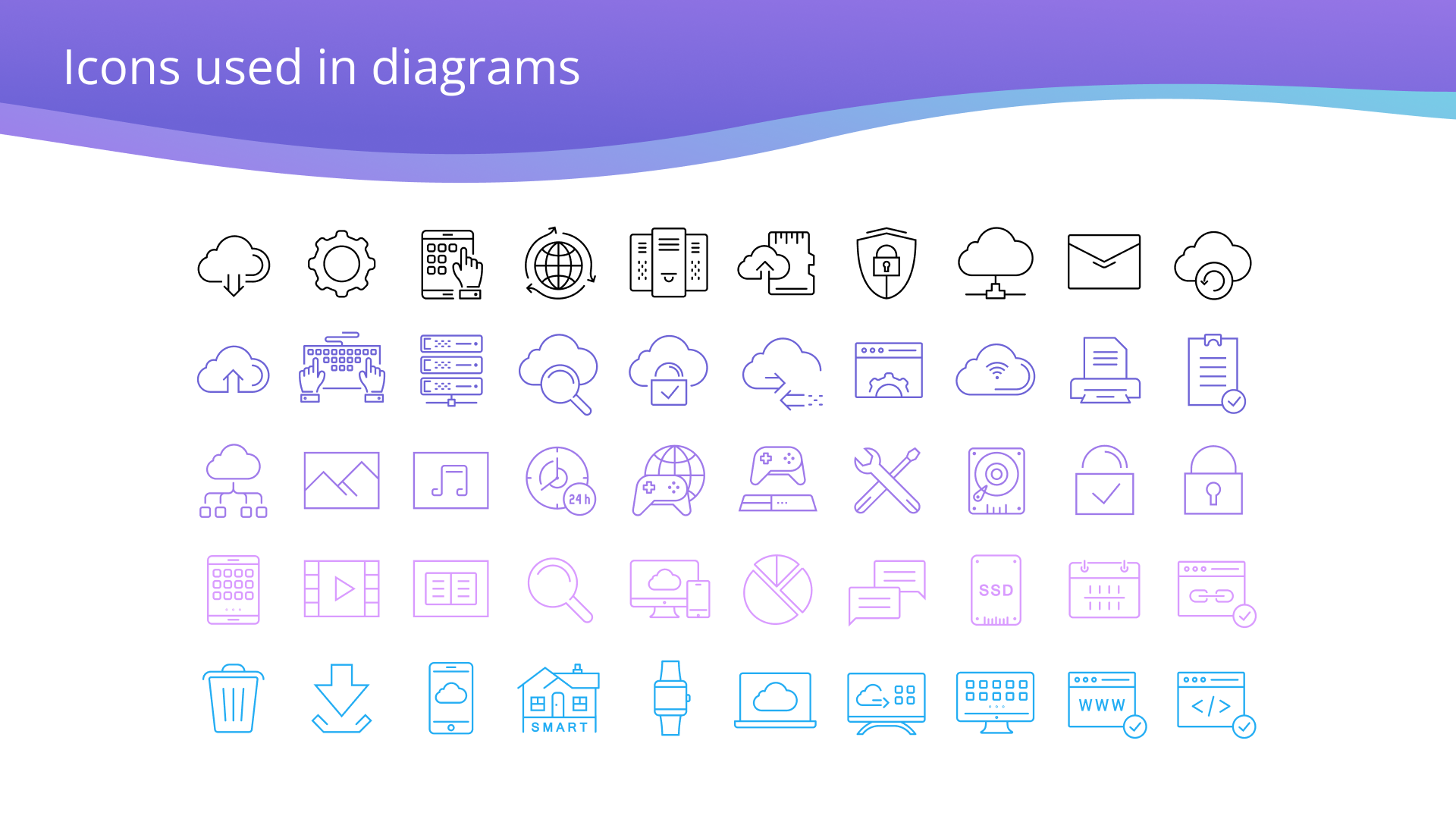
At a certain point, we realized that, while we loved the graphics we were pulling for inspiration, each one of those graphics would take us 5+ days to create. This would be fine if we had a small army of designers dedicated to creating these beautiful images. However, in reality, my team has one dedicated designer, she was usually turning out one to five images per day already. So. we needed a way to maintain this cadence while up-leveling the quality of the graphics.
As a solution, we looked into graphic types that would be the fastest and easiest to create while still embracing the new styles. We found that each of the three options leveraged isometric graphics in some fashion. Because isometric graphics were consistent across all three of our design concepts, we could start making progress on this right away using the existing branding. Finding opportunities to make progress right away is one of the best things you can do to get the eventual buy-in.
5) Explore how each option will look in different areas
It’s important to explore how each brand touchpoint will change with the various design options. Not only will this help you fully explore and plan ahead, it will also help non-designers visualize the brand in action so they can make an educated decision.
Some questions to get you started include:
- How will graphics change?
- How will the website change?
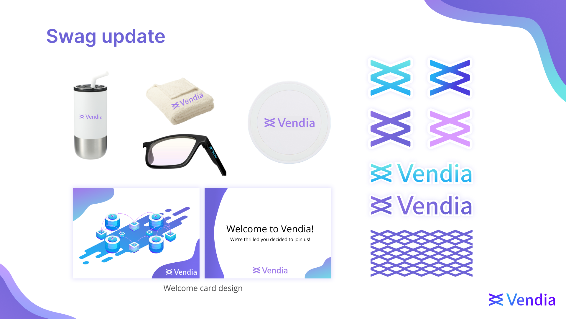
- What will swag look like?
- What is there to look forward to with each design option?
You’lll find that the core elements of each style will evolve and solidify during this step.
6) Get feedback from your key stakeholders
When working on a project this big, it’s essential to get feedback from future users. In our case, our primary users were our marketing team.
We met with them to walk through the initial rebrand concepts and get their thoughts. This initial review allowed us to adapt our work based on the feedback we received and hear unique points of view on each.
In this meeting, we heard descriptions that we didn’t expect to hear like, “This one feels expensive.” We also got feedback to drop the names we had given each style, as they could create bias.
7) Bring leadership along on the journey
It’s the moment of truth and you’re finally going to present all of your hard work to the leadership team. At this point, it’s likely that you already have a favorite style, and you’re excited to pick the new branding and start moving forward. Despite your excitement, you need to take a step back and explain to your leadership team how you got to this point.
- Explain the challenges your current branding faces today
- Highlight the objectives of the new branding
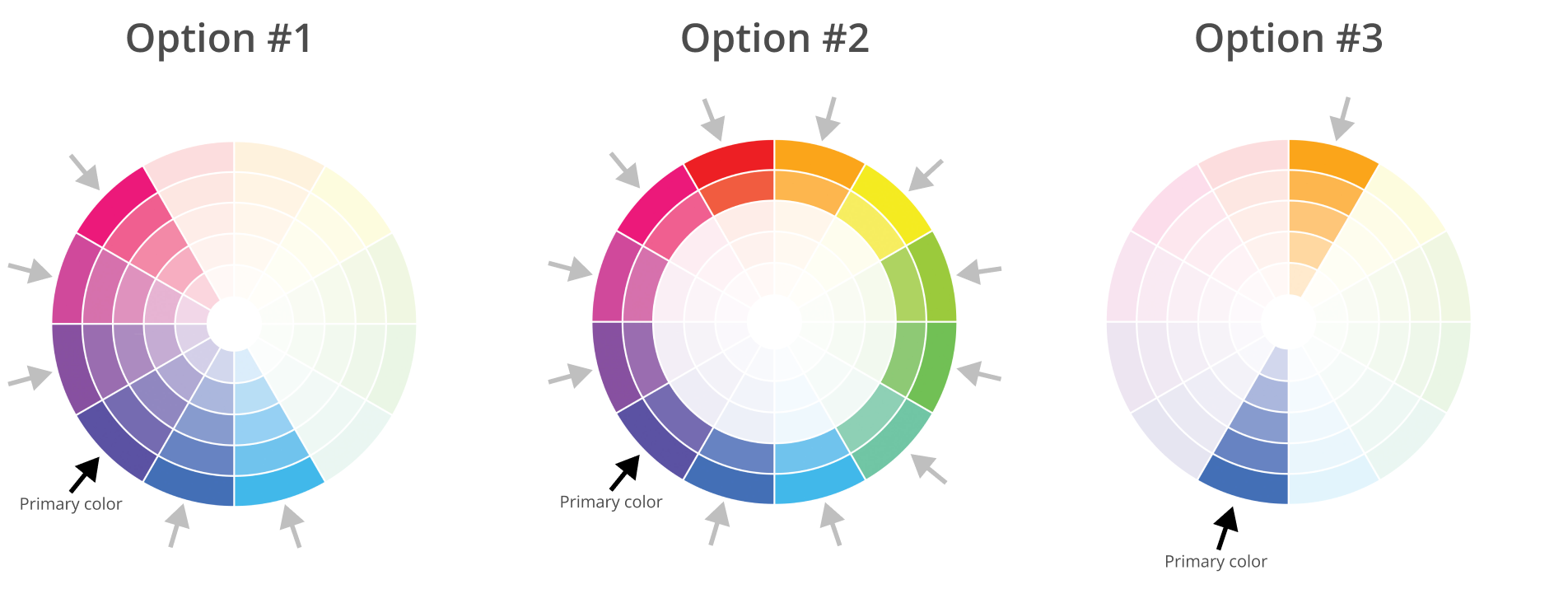
- Explain seemingly, basic design concepts in a visual way (such as the color wheels below)
- Present each of the options in a non-biased way (even if you have a favorite)
- End the presentation with a side-by-side comparison of each
- Remain neutral as you open it up for discussion
You’ll be surprised how much this helps. We got a lot of comments like:
- “I never even considered how our colors might be conflicting with notification colors.”
- “Seeing this now, I feel strongly that we should move toward a more accessible experience.”
- “Wow, I had no idea so much thought went into picking colors.”
- “I personally love option #3, but I think option #1 speaks more to who we are as a company.”
Not only do these steps help your team understand the “why” behind the rebrand and a design concept more clearly, it helps them to feel passionate about the steps forward, too.
When is the right time to redesign your brand identity?
This is one of the hardest questions to answer since a brand makeover is a massive undertaking and requires support from across the company. Here are a few considerations to help you and your team weigh the priority and scope of your brand redesign.
- Identify how often the branding is impeding progress
Our brand green was our core brand color, but it couldn’t be used for text—at all. Many people would want to “add some branding” to their presentations or projects and would end up adding the green as a text color. So the design team would often have to go through and take it all out at the finial polish. This is where one of the biggest red flags came up: When we removed the green and opted for an accessible, neutral blue, it made the whole expression very “cold” and “early 2000’s tech.” So while we had thought we had a fix, it was very much a bandage.
- Evaluate the demand
When we decided to start the rebrand project, the sales and marketing teams had just doubled in size and were about to do it again, so the demand for branded content, design support, and tools as templates was high…and about to skyrocket.
- Evaluate bandwidth
The design team had established templates and graphics that we could use to help move the brand forward with the new branding. This elevated some of the repetitive design work that often took more time to roll out than expected or preferred. We’d also just hired an in-house graphic designer (remember, we’re still in startup), so we finally had some extra bandwidth and expertise to make the project come to life.
- Identify priorities and socialize the work deliberately
It’s worth calling out that this brand redesign started as a side project for the design team. We had a week long off-site where we did a deep dive on our brand identity, conducted research, and agreed upon the options and direction.
After that, all the work we created happened when we had free cycle time. Some weeks, we didn’t get to touch the branding project at all because we were busy with other “need to have” projects that would drive our business forward.
For the first weeks of the redesign project, we kept the project pretty quiet since we knew it wasn’t a priority for anyone else (and we weren’t in a position to commit to a hard date). When we were far enough along to share some of it, we scheduled a meeting with the marketing team to review and started talking about it more openly.
Key takeaway: Work the process
The brand redesign process is, indeed, a process. It takes time, documentation, iteration, curiosity, and patience to hone your brand identity. At Vendia, we took as much time and care with the front end of our redesign (research, concepting, iterating, and testing the concepts) as we did rolling the rebrand out across web, social, and all of our graphics and collateral. The number one thing to remember is that the brand will evolve and solidify throughout the design process.
Join our team
At Vendia, sharing is at the core of what we do. We envision a world where, through better sharing, people are free to innovate and make a great impact on those around them. Everyday, we pursue our mission by building a revolutionary SaaS platform that unshackles customers from the opportunity costs and burdens of IT drudgery and maintenance expenses, empowering them to focus on creating and running highly scalable, fault-tolerant, cross-cloud, multi-party, real-time data applications.
Won’t you join us? Explore job opportunities and follow along with Vendia and watch our brand, product, and our community continue to grow.